No items found.

Loading something special...


Web Design, Branding, Information Architecture, UI/UX Design, Webflow Development, CMS, HubSpot, Finsweet
A conversion-focused hiring platform and talent network built to connect underrepresented software engineers in Philadelphia, Boston, and surrounding areas with CTOs, engineering managers, and recruiters ready to hire.
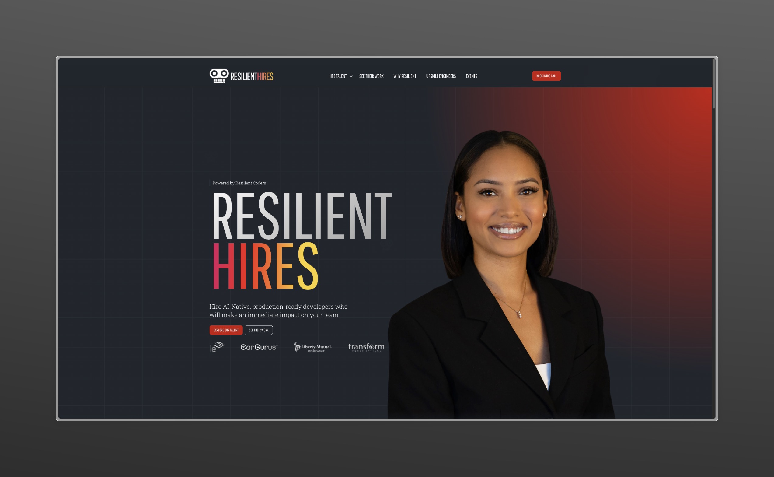


Resilient Hires became a statement piece for what the Resilient Coders organization represents: bold aspiration, relentless pursuit, and a confidence not often seen in this industry. It's a platform that does not just list engineers; it advocates for them. And it does it in a way that makes hiring partners stop, look, and believe.
Discovery started with the Resilient Coders team completing a detailed intake form covering what worked on their existing presence, what was not landing, and where they wanted to be. Conversations with Mel, Director of Operations, and Stephanie, Director of Strategic Partnerships, surfaced the real brief: strong talent, no platform built to speak to the people doing the hiring. The intake form asked strategic questions about what separates Resilient Coders from others in their space, the audience they want to attract, what defines success, and more. This led to a full brief document outlining the site's purpose, timeline, deliverables, and overall page structure before any design began. Because Resilient Hires was net-new, the audit focused outward, benchmarking five comparable platforms: CodePath, Fraction, Year Up United, Braven, and DeepHire.ai. The strongest sites led with powerful heroes and immediate social proof, guided users straight into their solution, and showcased talent in structured browsable formats. What held most back was length, visual blandness, and no clear directional pull. What the Resilient team responded to most: detailed skill listings, prominent hiring company logos, and a simple 3-step process communicating how they make a difference.
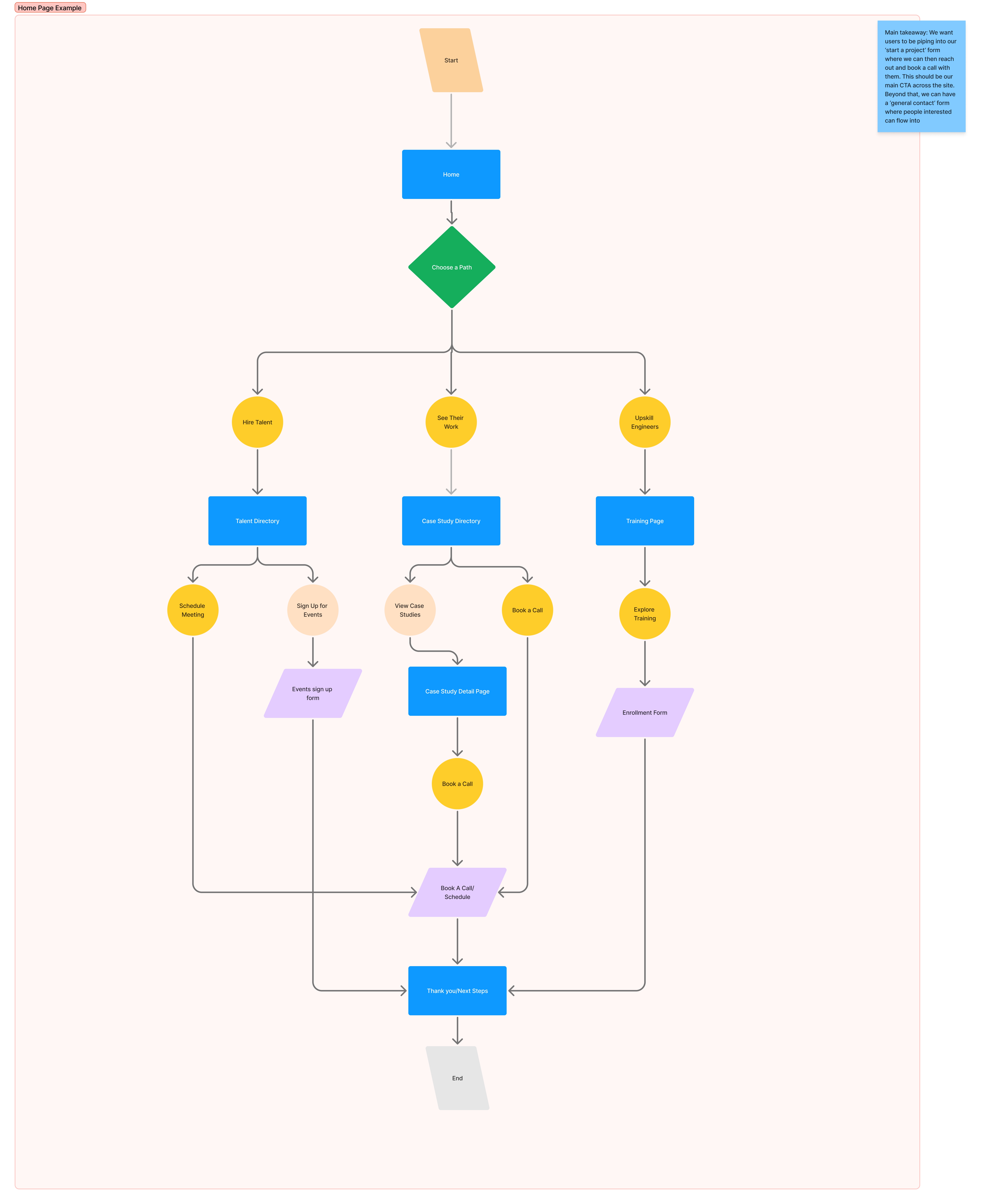
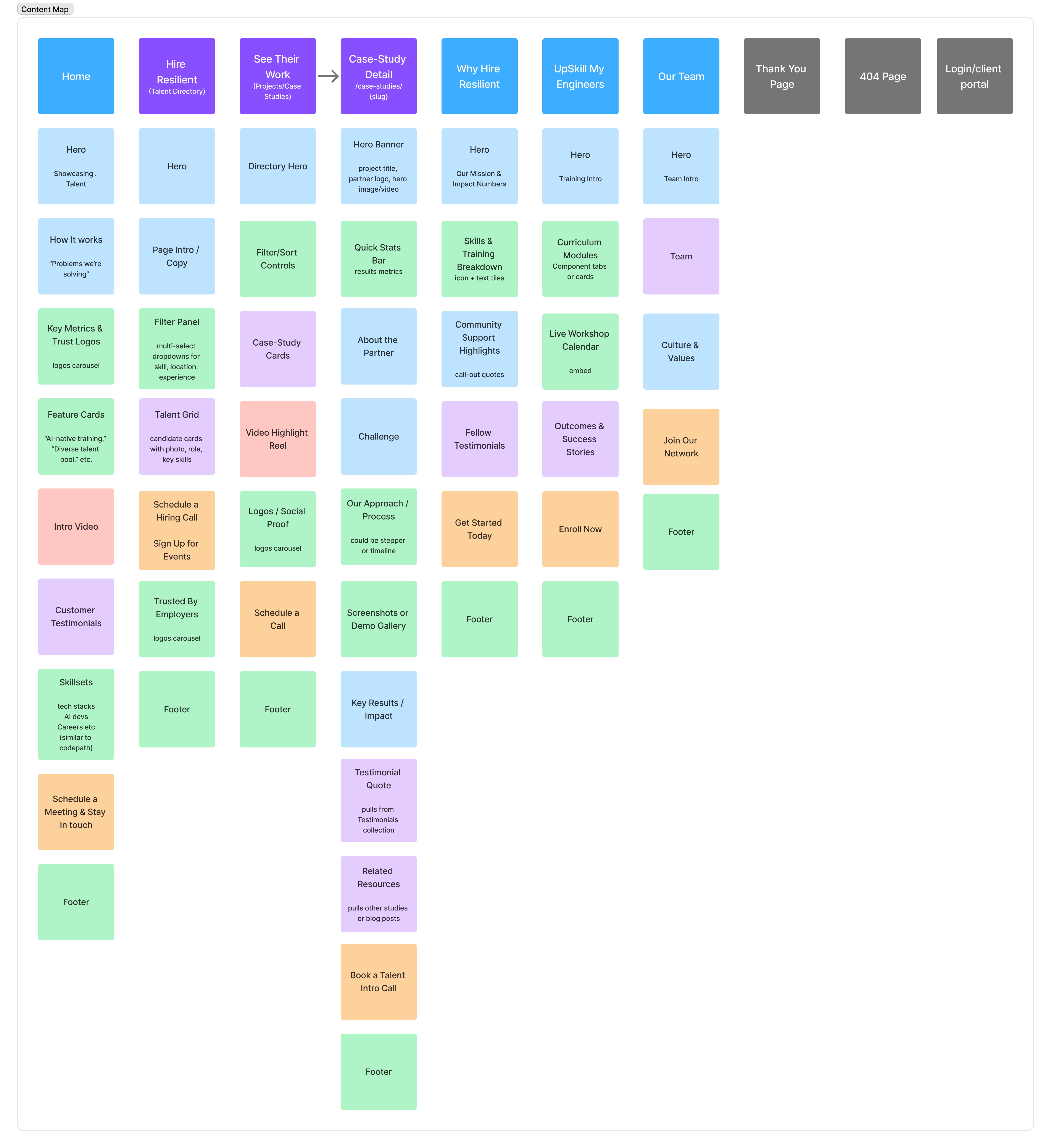
Three primary user types were mapped, each with a distinct entry point and funnel. Recruiters and hiring managers ready to act were routed to the talent directory. Stakeholders who needed proof of capabilities were routed to case studies. Organizations interested in upskilling their engineering teams were routed to training and events. Every path pointed to the same destination: booking an intro call. The content map landed at eight core pages before any design began: Home, Hire Resilient (talent directory), See Their Work (case studies), Why Hire Resilient, Upskill Engineers, Our Team, a form confirmation page, and utility pages. Each page was given a single job in the funnel. The homepage serves as the primary touchpoint, telling the RC story efficiently, showcasing partner companies, and highlighting engineers and skillsets. Everything else supports one of the three main funnels.
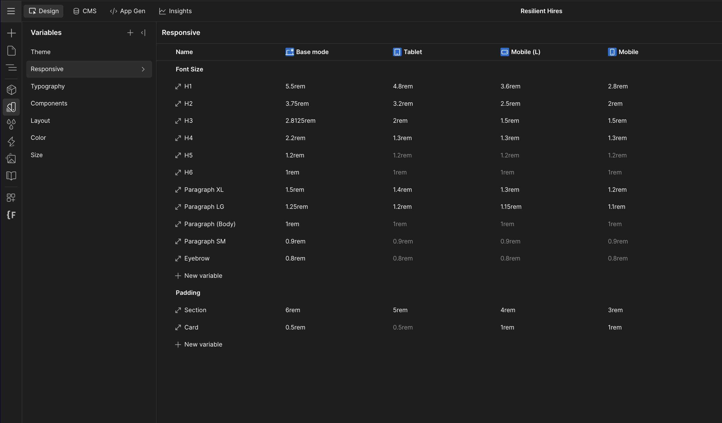
The moodboard took the longest to arrive at and produced the most decisive creative direction of the project. Early references from competitor research were not hitting the bar. The shift came from discovering Zeka's bold minimalism: strong singular subjects surrounded by commanding typographic elements. It captured exactly what Resilient Hires needed to say about its engineers without saying it directly.For color, Spider-Man: Across the Spider-Verse unlocked everything. Abstract styles, bold contrasting colors, and layered elements that read as cohesive despite their visual loudness. The governing logic: loud and proud, but synchronized.Wireframes used Relume as a structural starting point, then were refined through client feedback. A color-grading pass confirmed that hard red-to-blue transitions carried the right tonal energy. The key decision: simplify. With such bold colors and typography, dialing back imagery and letting the content carry more weight went a long way.The brand system was built on Pathway Gothic One for headings and Roboto Slab for body, already part of the RC brand, with a button system designed to always contrast its background (red on blue, blue on red). A full Figma component library was built covering video sections, bento grids, hero elements, testimonial cards, and marquees. The goal was premium yet familiar: easy to update for the RC team, with variable mapping in both Figma and Webflow kept deliberately simple.


The final build landed at 12 pages plus CMS templates, built on the MAST framework for class structure and variable management. With all pages already designed in Figma, the porting process was straightforward: set up global styles and components, build the main pages, then assemble interior pages from the established system.

The main architectural lift was the CMS system: five collections in total, Fellows, Case Studies, Testimonials, Events (regular and upskill workshops), and Tech Stacks. Nearly every section of the site pulls from at least one collection, connected through an intricate network of reference and multi-reference fields that hold everything together.
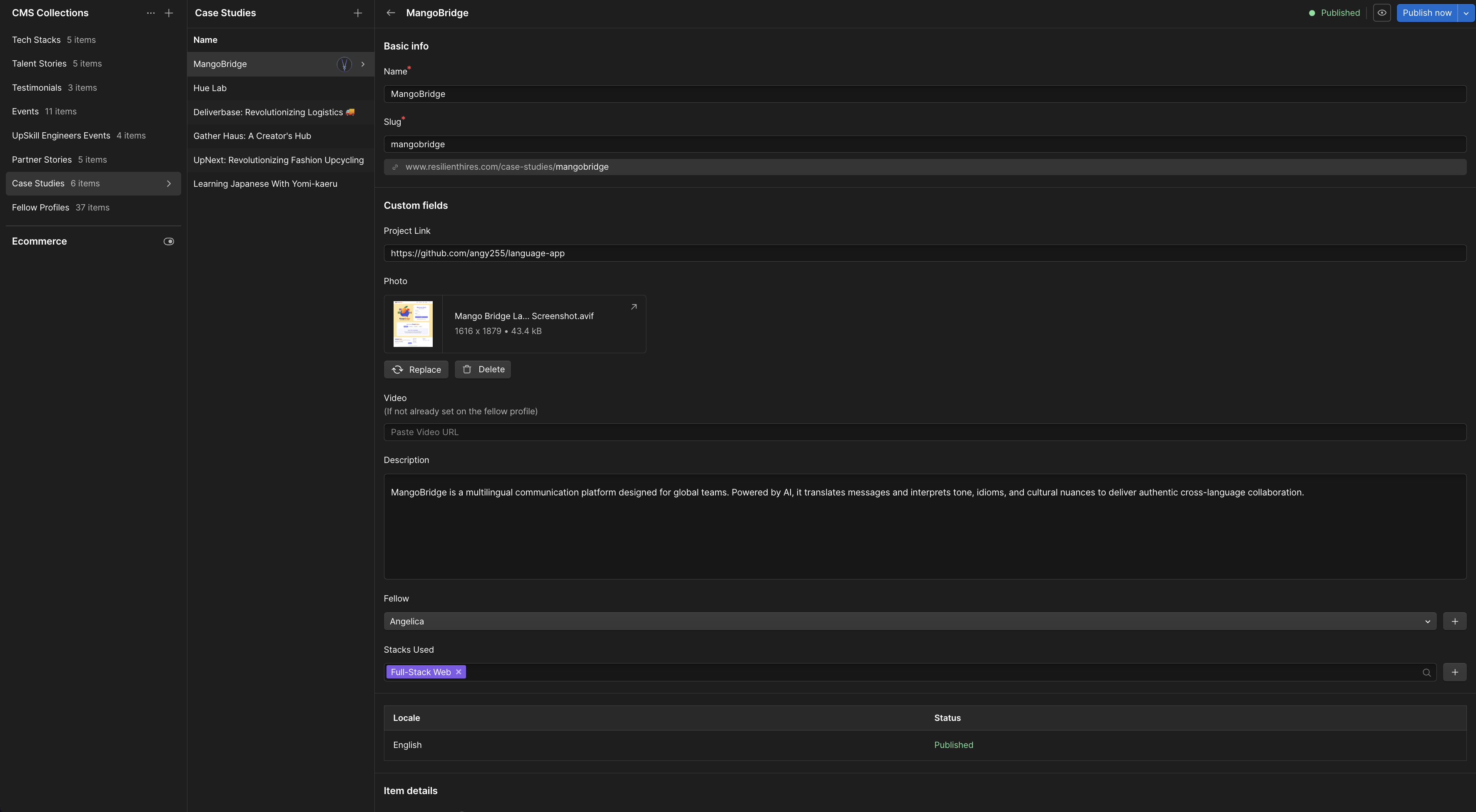
The talent directory is the core of the platform. It immediately answers three questions for every fellow: who they are, what they specialize in, and where they are located, alongside a strong cutout portrait that showcases the diversity of the Resilient network. For deeper evaluation, the Finsweet-powered filter bar allows sorting by any combination of tech stack, location, and experience level. The count updates automatically as selections are made, and a seamless load-more keeps the experience fluid with no page reloads. Each fellow card features a bright red background for standout presence, a high-quality cutout photo, tech stack icons in the top left, and the fellow's name in a large typeface above their title. These cards give every engineer a premium, polished look that makes a recruiter want to learn more. Behind the scenes, the Webflow CMS allows the Resilient team to feature only the latest cohort's fellows and add or remove talent with ease, keeping the directory current without any developer involvement.
.png)

.png)


HubSpot handles all lead capture across the site through custom-styled forms that match the brand. Forms cover newsletters, intro call bookings, contact inquiries, and individual fellow-specific booking buttons that dynamically pull the fellow's name from the CMS so every lead is automatically attributed to the right person. On event pages, the team can paste a HubSpot form ID directly into the CMS field and the form populates on the page instantly, no embedding code, no developer involvement, no need for external platforms like Eventbrite. This allows the marketing team to create event-specific forms and have them live within minutes. The integrated system gives Resilient Coders full visibility into their pipeline: page views, button clicks, and detailed lead data all tracked internally. A comprehensive lead-generation operation that lives entirely within their own site.

.png)
The most technically demanding element of the build is the headline system used throughout the site. Each title combines a large primary word with a secondary phrase or supporting word in varying layouts, creating the magazine headline effect that defines the visual language. These headlines had to balance being large and vibrant across all screen sizes without breaking across the many word-length combinations. This required a three-pronged solution: clamp-based text sizing that scales seamlessly to any screen, a three-column grid structure housing the main word, supporting phrase, and description with CTAs as separate zones for GSAP targeting, and a component library of heading layout variants for the team to mix and match. Getting consistent behavior across color blends, screen sizes, and animation states was the most complex problem on the build and the most visually distinctive result.


If you're impressed with my work, then let's make something special together
-Vince Wimberly Jr.
Owner of Life Advance Fitness